Reports
Below are descriptions of reports generated by the centreseq core module. Examples follow where applicable.
Summary Report
./reports/summary_report.tsv
./reports/summary_report_singletons_removed.tsv
Large .tsv file containing detailed information for each cluster detected by centreseq. Displays representative sequence label, number of members, and which sequence labels belong to the cluster. In addition, a filtered report is provided which does not contain any singleton clusters.
Core Gene Count Report
./reports/core_gene_count_report.txt
Contains general metrics on the # of core genes detected among 100% of samples, >=90% of samples, and >50% of samples.
# genes shared among 100% of samples:       2497
# genes shared in >=90% of samples: 3548
# genes shared in >=50% of samples: 3991

Results were generated with:
    min_seq_id      = 0.95
    coverage_length = 0.95
Roary Gene Count Report
./reports/roary_gene_count_report.txt
Gene count report represented in the style of Roary’s output.
Core genes  (99% <= strains <= 100%)        3334
Soft core genes     (95% <= strains < 99%)  178
Shell genes (15% <= strains < 95%)  1311
Cloud genes (0% <= strains < 15%)   21966
Total genes (0% <= strains <= 100%) 26789

Results were generated with:
    min_seq_id      = 0.95
    coverage_length = 0.95
Pairwise Report
./reports/pairwise_gene_match_report.tsv
Large tab-delimited file which stores pairwise information on samples regarding matching core cluster counts. Used to generate the network visualization.
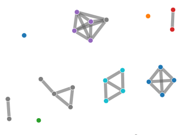
Network Chart
./network_graph.html
./network_graph_coding.tsv
The network chart presents a visualization of genome relatedness generated from the pairwise report file from the core module. Links are drawn between all pairs of genomes that share a relationship determined by % of matching core clusters. This percentage threshold value can be adjusted via a slider.
Samples can be subset into arbitrary colour-coded groups through the network_graph_coding.tsv file.
Gene Count Curve
./reports/gene_count_curve.png
./reports/gene_count_curve.csv
Visualization generated showing the # of ‘core’ genes vs. the # of ‘pan’ genes with increasing numbers of sampled genomes.

Looping over a range from 1..n, the following process is executed,
- n samples are randomly selected
- Number of core genes shared between the subset calculated
- Total number of genes existing among the subset is calculated
By default, this entire process is repeated 5 times and the values averaged to reduce variance from the random sampling.